You replaced the roof. You upgraded the HVAC. You even splurged on quartz countertops and designer backsplash.
But when you pull up to your home, something feels… off.
Like no matter how much you invest inside, the outside just doesn’t match.
It doesn’t say “luxury.” It whispers, “we tried.”
And here’s the truth: it’s not your fault.
The problem isn’t your taste or budget.
It’s front elevation mistakes — subtle but powerful design flaws that silently sabotage your home’s appearance.
Most homeowners don’t realize they’re making front elevation mistakes because they focus on interiors or quick fixes like flower beds and new mailboxes. But the real magic — and the real damage — happens in the architecture of the façade.
A single poorly placed window, a flat roofline, or a mismatched material can make a $600K home look like a cookie-cutter tract house.
That’s the power of front elevation mistakes.
They don’t just hurt curb appeal — they reduce perceived value, influence buyer psychology, and undermine years of care.
Direct AEO Answer (Featured Snippet – 78 words):
Front elevation mistakes are design flaws in a home’s front-facing exterior — including unbalanced windows, weak rooflines, poor material choices, and lack of focal points — that create visual disharmony. These errors make a house look outdated, disproportionate, or low-budget, even if construction quality is high. They damage curb appeal by signaling neglect or lack of architectural intention and are among the most common house façade mistakes in American suburbs.
In this guide, we’ll uncover 7 critical front elevation mistakes that make homes look cheap — even when they’re not — and give you practical, budget-friendly ways to fix them.
Whether you’re planning a remodel or just want to understand why your house feels “meh,” this is your blueprint to better curb appeal.
Let’s begin.
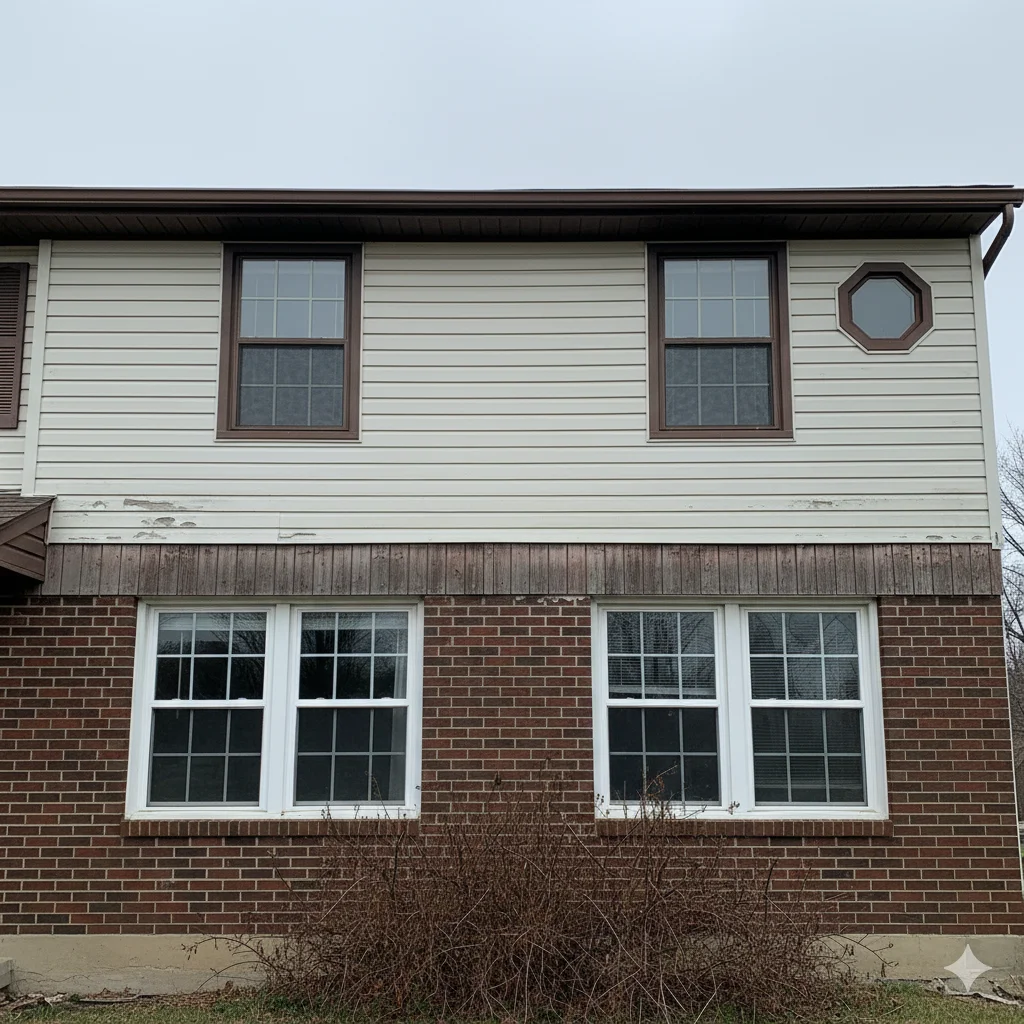
Mistake #1: Poor Window Proportions & Placement
Why This Is a Common Problem
Windows are more than functional openings — they’re essential elements of home exterior design.
Yet, so many homes suffer from poor window proportions, and it all starts with developers.
To save time and money, builders install standard-sized windows wherever framing allows — not where aesthetics demand.
No thought goes into alignment, rhythm, or balance.
The result?
A haphazard arrangement that breaks visual harmony.
And when windows feel random — too small, too tall, or misaligned — our brains register disorder.
This is one of the most frequent front elevation mistakes in modern housing developments.
Because symmetry and proportion are hardwired into human perception, any deviation makes a house feel “off” — and “off” reads as cheap.
How It Makes a House Look Cheap
Imagine two similar homes on the same street.
- Home A: Windows are evenly spaced, vertically aligned, and consistent in height.
- Home B: Upper-floor windows float above blank walls. Some are narrow, others wide. One is tucked beside the garage like an afterthought.
Which one looks intentional?
Which one looks like someone slapped parts together?
Exactly.
Poor window placement creates visual chaos. It disrupts the flow of the façade, making the home appear unplanned.
Even if the materials are premium, bad window layout undermines everything.
These front elevation mistakes scream lack of design thinking — a red flag for buyers and neighbors alike.
Visual Description
Picture a two-story colonial with five second-floor windows… but only three on the first floor.
Or a modern farmhouse with oversized black-framed windows on the living room wall — while the master bedroom gets a tiny 24×36 pane.
Or worse: windows that don’t stack vertically.
The upstairs window hovers over siding instead of aligning with the one below. It looks unstable — like the house might tip over.
These aren’t minor details. They’re glaring signs of front elevation mistakes that destroy curb appeal.
Practical Tips to Fix or Avoid It
✅ Follow the Rule of Alignment: Stack upper-floor windows directly above lower ones. Vertical continuity adds stability and elegance.
✅ Use Rhythm: Repeat window sizes and spacing across the façade. For example, a sequence of large-medium-large creates visual interest without chaos.
✅ Avoid Extremes: Tiny windows make a house feel closed off; massive glass walls without support feel industrial. Aim for balanced proportions — typically, window height should be 1.5x to 2x its width.
✅ Group Small Windows: Cluster bathroom or utility windows together so they don’t break up the wall.
✅ Budget-Friendly Hack: Paint all window frames the same color — especially a dark contrast (black, navy, charcoal). This visually ties disparate sizes together.
✅ Pro Tip: Hire a designer to sketch a simple modern elevation plan before replacing windows. It prevents costly front design errors down the road.
Engagement Question:
Have you ever noticed a house where the upstairs windows don’t line up with the ones below? Did it bother you — or were you the only one who saw it?
Mistake #2: Ignoring Roofline Drama (Flat & Boring Roof Designs)
Why This Is a Common Problem
Let’s talk about the crown of your home: the roof.
Most builder-grade homes today have flat, single-plane gable roofs — long, boxy triangles stretching from end to end.
Why? Because they’re cheap to build and easy to engineer.
But here’s the problem: flat rooflines lack character.
They offer zero drama, no hierarchy, no depth.
And when your roof doesn’t contribute to the design, your entire front elevation becomes passive — like a face without expression.
Architects call this “monotonous massing.” Translation? Your house looks like every other one on the block.
This is one of the most overlooked front elevation mistakes — yet it has the biggest visual impact.
How It Makes a House Look Cheap
Think about iconic homes you love — old Victorians, Craftsman bungalows, Mediterranean villas.
What do they have in common?
Dynamic rooflines.
Multiple pitches, dormers, turrets, gables, and overhangs that play with shadow and depth.
Now compare that to a split-level with one flat roof plane and zero variation.
Which says “luxury”? Which says “cut corners”?
A boring roof flattens your façade. It removes dimensionality. Without shadows and angles, there’s no contrast — and without contrast, there’s no visual excitement.
And a lifeless front elevation = a cheap-looking home.
Even if you use premium materials, a flat roof drags everything down. It’s like wearing a ballgown with sneakers.
These front elevation mistakes make your home look generic and uninspired.
Visual Description
Close your eyes and picture a typical suburban ranch.
One long roofline. No peaks. No dormers. Maybe a small overhang above the door.
Now imagine standing across the street. What do you see?
A slab. A rectangle with a triangle on top.
No movement. No focal point. Nothing pulls your eye upward.
Contrast that with a home that has:
- A steep central gable
- Two lower side gables
- A dormer poking through
- Deep eaves casting shadows
Suddenly, there’s rhythm. There’s texture. There’s story.
That’s the power of roofline drama — and avoiding this house façade mistake is key to strong curb appeal.
Practical Tips to Fix or Avoid It
✅ Add Dormers: A simple gabled or shed dormer adds instant character and usable attic space. Even faux dormers boost curb appeal.
✅ Break Up the Mass: Use intersecting roof planes. Add a porte-cochère, covered entry, or side wing with a different pitch.
✅ Extend Eaves: Deeper overhangs create shadow lines and protect walls. They also signal craftsmanship.
✅ Use Accents: Decorative beams, exposed rafter tails, or metal roofing on gable ends add flair.
✅ Budget-Friendly Hack: Install gable vents with ornamental designs or paint the underside of eaves a contrasting color (like navy). Instant depth!
Around the world, homeowners, real estate agents, and architects use the psychology of color in home exterior design strategically. In London, navy blue doors are linked with tradition. In Miami, bright yellow homes radiate joy. In Tokyo, soft grays reflect minimalism and order.
✅ Pro Tip: Consider a metal accent roof on a front-facing gable. Copper or standing-seam steel draws the eye and feels high-end — even on a modest home.
Engagement Question:
Walk around your neighborhood — how many homes have interesting rooflines vs. flat, basic ones? Do the standout houses tend to get more compliments?
Mistake #3: Mismatched or Low-Quality Exterior Materials
Why This Is a Common Problem
Here’s a harsh truth: not all siding is created equal.
Many homeowners choose vinyl because it’s affordable and low-maintenance. Others pick fiber cement for durability.
But here’s where things go wrong:
They mix materials poorly — like brick on the bottom half and cheap lap siding on top — or use low-grade versions that warp, fade, or look plastic-y within a few years.
And then there’s the trend of slapping stone veneer around the front door like lipstick on a bulldog — with no integration into the overall design.
These decisions often stem from budget constraints or lack of guidance. But the outcome? A patchwork façade that screams “we couldn’t decide.”
And that’s one of the top front elevation mistakes undermining curb appeal.
How It Makes a House Look Cheap
Ever seen a house where:
- The garage has smooth fiber cement panels
- The main wall has textured vinyl siding
- The entry has thin faux stone stacked unevenly?
That’s a material identity crisis.
When materials clash in color, texture, or scale, the eye doesn’t know where to land. Instead of feeling cohesive, the house feels like a collage of afterthoughts.
Cheap materials also weather poorly. Vinyl buckles in sun. Thin stone looks cartoonish. Paint peels off particle-board trim.
And once materials start degrading, the whole house looks neglected — even if it’s brand new.
Luxury homes use consistent, high-quality materials that age gracefully. Think natural stone, cedar shingles, stucco, or brick. When done right, they feel substantial, authentic, and timeless.
These front elevation mistakes make your home look like it was assembled, not designed.
Visual Description
Imagine a beige ranch with:
- Dark brown “stone” around the entry (but it’s clearly lightweight foam)
- White vinyl siding with wavy texture
- Gray composite panels near the garage
- Brown aluminum trim that’s already fading
Now imagine a home with:
- Smooth gray stucco base
- Vertical wood-look boards above
- Natural limestone water table
- Cedar shingle accents in gables
Which one looks expensive?
Which one looks like it belongs in a luxury development?
The difference isn’t price — it’s material harmony.
And failing to achieve it is a classic house façade mistake.
Practical Tips to Fix or Avoid It
✅ Limit Material Palette: Use 2–3 exterior materials max. Example: brick + wood siding + stone accent.
✅ Scale Matters: Large-format stone or wide board siding reads as higher-end than small, busy patterns.
✅ Match Quality to Climate: In humid areas, avoid moisture-prone composites. In sunny regions, choose UV-resistant finishes.
✅ Budget-Friendly Hack: Paint existing siding a rich, solid color (charcoal, olive, navy). Uniform color unifies mismatched textures.
✅ Upgrade Selectively: Focus high-end materials on focal points — entry, gables, corners. Use simpler materials elsewhere.
✅ Pro Tip: Add real wood accents — even small ones like corbels, brackets, or a timber frame around the door. Real wood ages beautifully and signals quality.
Engagement Question:
Have you seen a home where the “stone” around the door looked obviously fake? Did it ruin the whole look for you?
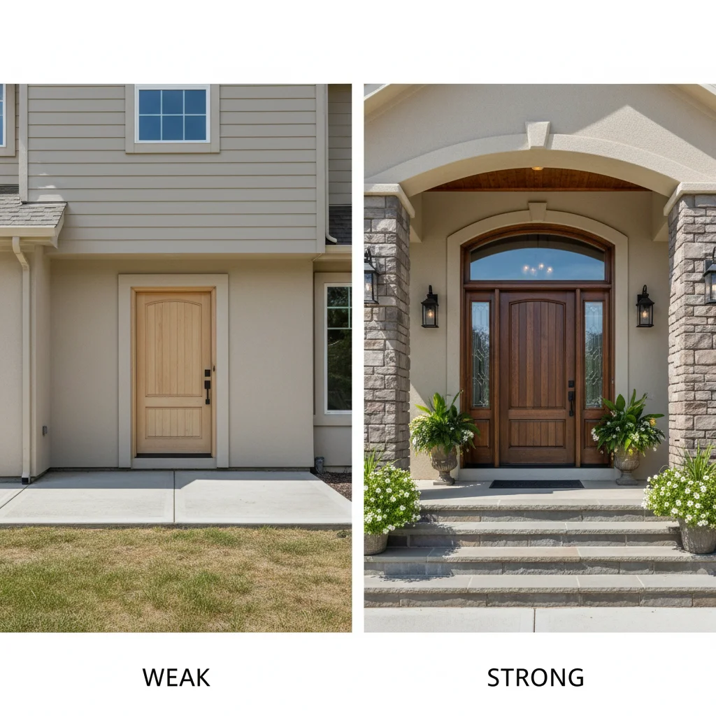
Mistake #4: Weak or Generic Front Door Design
Why This Is a Common Problem
The front door is your home’s handshake.
It’s the first thing guests touch, the last thing thieves check, and the emotional gateway between outside and in.
Yet, most homes have builder-basic doors: hollow-core fiberglass, white or stained oak, six-pane grids, zero personality.
Why? Because developers install what’s cheapest and fastest.
But here’s the irony: a $200 door can make a $500K home look ordinary.
And since the front door sits at the center of your elevation, its impact is magnified.
A weak door doesn’t just fail to impress — it drags down the entire façade.
This is one of the most damaging front elevation mistakes — because it ruins the first impression.
How It Makes a House Look Cheap
Think about it.
You drive up to a gorgeous brick colonial. Then you see the door: a flimsy white six-panel with a brass knob and plastic sidelights.
What’s your reaction?
“Nice house… shame about the door.”
A generic door makes the home feel impersonal. Like no one cared enough to customize it.
And when the focal point lacks character, the whole design feels lazy.
Even worse: mismatched hardware, poorly proportioned sidelights, or a door that’s too small for the opening.
All of these front elevation mistakes whisper, “This was assembled, not designed.”
And that’s why your home looks cheap, even if it’s not.
Visual Description
Picture a grand porch supporting a massive columned entry… leading to a 30-inch-wide hollow door with a $40 knob.
Or a sleek modern box home with floor-to-ceiling glass… interrupted by a sad wooden door with chipped paint.
Or a craftsman bungalow with beautiful woodwork… ruined by a shiny black steel door with diamond-grid glass.
These mismatches break the narrative. They disrupt the style language of the home.
A strong door reinforces architecture. A weak one betrays it.
And that betrayal is one of the most visible front design errors.
Practical Tips to Fix or Avoid It
✅ Invest in Solid Core: At minimum, upgrade to a solid-core fiberglass or wood door. It feels heavier, insulates better, and sounds more secure.
✅ Choose Style-Specific Doors:
- Craftsman? Try horizontal planks with iron hardware.
- Modern? Frameless glass or matte black steel.
- Farmhouse? Double doors with X-bracing.
- Colonial? Paneled door with transom.
✅ Size It Right: Door should feel proportional to the entry. Too small = weak. Too large = overwhelming.
✅ Add Sidelights & Transoms: Glass panels on sides or above increase light and elegance — but ensure they match the door style.
✅ Paint Boldly: Navy, forest green, black, or terracotta make a statement. Avoid builder white unless part of a crisp monochrome scheme.
✅ Hardware Matters: Upgrade knobs, handles, and knockers. Matte black, oil-rubbed bronze, or unlacquered brass add instant sophistication.
✅ Pro Tip: Frame the door with columns, pilasters, or a portico. Even small supports add gravitas and draw attention where you want it.
Engagement Question:
What’s your favorite front door color? Have you ever walked past a home just to admire its entryway?
Budget-friendly front elevation upgrades like fresh paint, modern lighting, door replacement, and stylish house numbers can boost curb appeal and home value by up to 15%. These low-cost improvements offer high return on investment (ROI) and are easy to do in a weekend.
Mistake #5: Neglecting Entryway Hierarchy (No Focal Point)
Why This Is a Common Problem
Great architecture tells a story.
And every story needs a hero.
In front elevation design, the entryway should be the star.
But so many homes treat the front door like an afterthought — plopped in the middle of a blank wall with no fanfare.
No steps. No canopy. No lighting. No landscaping.
Just… a door.
This lack of hierarchy — the visual ranking of elements — is a silent killer of curb appeal.
When nothing stands out, the eye wanders aimlessly. There’s no “aha” moment. No invitation.
And a home without a focal point feels like a background player — not a destination.
This is one of the most common front elevation mistakes, especially in post-2000 construction.
How It Makes a House Look Cheap
Imagine two homes:
- Home A: Elevated stoop, double columns, recessed entry, pendant light, potted plants, step lighting.
- Home B: Door flush with siding, one concrete step, bare bulb overhead, weeds nearby.
Which one says “welcome”?
Which one says “don’t ring the bell”?
A weak entry diminishes the entire house. It suggests indifference. Like the owners don’t care enough to make a first impression.
Luxury homes emphasize arrival. They slow you down with layers: path → steps → landing → door.
Each layer builds anticipation.
Skip those layers, and you lose the drama.
And that missing drama is a textbook front elevation mistake.
Visual Description
Visualize a plain front door centered on a flat wall. No overhang. No texture change. No color contrast.
Now imagine that same door set back under a gabled portico, flanked by stone columns, lit by sconces, with a curved walkway leading up.
See the difference?
One is forgettable. The other is memorable.
Hierarchy isn’t about size — it’s about emphasis. Use depth, lighting, materials, and landscaping to say: This is important.
Ignoring this principle is one of the costliest house façade mistakes.
Practical Tips to Fix or Avoid It
✅ Create Depth: Recess the door or add a small porch. Even 12 inches of setback adds dimension.
✅ Raise the Entry: Add 2–3 steps. Height signals importance.
✅ Frame It: Use columns, arches, or sidelights to enclose the entry zone.
✅ Light It Right: Install layered lighting — overhead, sconces, step lights, landscape uplights.
✅ Landscape the Path: Curved walkways, border plantings, and flanking pots guide the eye.
✅ Budget-Friendly Hack: Paint the door + trim + house number in a bold accent color. Instant focus.
✅ Pro Tip: Add a transom window or decorative glass above the door. It catches light and draws upward movement.
Engagement Question:
When you visit a friend’s home, do you notice whether their entry feels inviting? What small detail makes the biggest difference?
Mistake #6: Overcrowded or Under-Lit Façade Lighting
Why This Is a Common Problem
Lighting is the jewelry of architecture.
But most homes either:
- Have zero exterior lighting (just a bare porch bulb), or
- Install too many mismatched fixtures (motion lights, floodlights, colored LEDs)
Both extremes hurt curb appeal.
Dark homes feel unsafe and uninviting. Over-lit homes look like convenience stores.
And poorly placed lights — shining directly into neighbors’ windows or creating harsh shadows — are worse than none at all.
The issue? People treat lighting as an electrical task, not a design element.
But at night, lighting is your front elevation.
And getting it wrong is one of the sneakiest front elevation mistakes.
How It Makes a House Look Cheap
Imagine driving past a home at dusk:
- Harsh white spotlight on the garage.
- Red LED strip under the eaves.
- Flickering solar stake lights in the lawn.
- Pitch-black front door.
Chaotic? Yes.
Expensive? Absolutely not.
Good lighting enhances form. Bad lighting destroys it.
Over-lighting feels desperate. Under-lighting feels neglected.
Either way, the home loses dignity.
Luxury homes use subtle, layered lighting to sculpt the façade — highlighting textures, guiding paths, and creating mood.
No glare. No clutter. Just quiet elegance.
Failing to do this is a major front design error that makes your home look cheap.
Visual Description
Picture a home glowing softly:
- Gentle wash on the front wall
- Uplights grazing tree trunks
- Sconces framing the door
- Step lights marking the path
- No visible bulbs or wires
Now contrast that with:
- Blinding floodlight on the roof
- Blue LED under the soffit
- Solar lights zigzagging the yard
- Dark entryway
One feels serene. The other feels frantic.
At night, lighting defines your home’s personality.
And poor choices are glaring front elevation mistakes.
Practical Tips to Fix or Avoid It
✅ Layer Your Lighting:
- Ambient: Soft wall washes
- Accent: Highlight textures, trees, art
- Task: Path and step lights
- Decorative: Porch sconces, lanterns
✅ Use Warm Color Temp: 2700K–3000K LED bulbs feel welcoming. Avoid cool white (5000K+).
✅ Shield Bulbs: Use fully enclosed or downward-facing fixtures to prevent glare.
✅ Control with Timers/Dimmers: Adjust brightness by time of night.
✅ Budget-Friendly Hack: Replace old fixtures with matching sconces. String fairy lights in trees for charm.
✅ Pro Tip: Hire a lighting designer for a site plan. Proper layout prevents hotspots and shadows.
Engagement Question:
Does your home feel safe and inviting at night? Have you experimented with outdoor lighting?
Mistake #7: Ignoring Scale & Proportion (Too Big, Too Small, Too Much)
Why This Is a Common Problem
Architecture is math disguised as art.
And the most overlooked equation? Scale and proportion.
Too many renovations fail because people add elements without considering how they relate to the whole.
Example:
- A massive garage door on a small cottage
- Oversized columns on a ranch
- Giant planters swallowing a tiny porch
These additions don’t complement — they overwhelm.
And when parts don’t fit the whole, the brain senses imbalance.
That discomfort? It translates to “this looks cheap.”
This is one of the most destructive front elevation mistakes — because it undermines the entire composition.
How It Makes a House Look Cheap
Scale mistakes destroy harmony.
Imagine a delicate Victorian with chunky PVC columns. Or a sleek mid-century with a bulky stone chimney.
The mismatch feels jarring — like putting sneakers on a tuxedo.
Even high-end materials fall flat when scaled wrong.
A tiny mailbox on a sprawling estate? Looks silly. A postage-stamp flower bed on a wide façade? Feels token.
Proportion is about visual weight. Every element should carry the right amount of attention.
Get it wrong, and your home looks like a DIY project gone wild.
And that’s exactly what these front elevation mistakes communicate.
Visual Description
Picture a modest Cape Cod with:
- A 16-foot-wide garage door
- Two 30-inch-wide windows on either side
- A front door squeezed in the corner
The garage dominates. The house looks like an accessory to the car.
Now imagine a balanced version:
- Smaller garage door offset
- Windows centered
- Door prominent under a porch
Suddenly, it feels human-scaled and intentional.
Ignoring scale is one of the most common house façade mistakes.
Practical Tips to Fix or Avoid It
✅ Follow the 1/3 Rule: Major elements (door, garage, windows) should each occupy roughly 1/3 of the façade width.
✅ Use Reference Points: Compare new elements to existing ones. Will that column look twice as thick as the others?
✅ Sketch It First: Draw a quick elevation or use apps like SketchUp Free to visualize changes.
✅ Step Back: View your home from the street. Does anything jump out disproportionately?
✅ Budget-Friendly Hack: Use landscaping to balance scale. Tall shrubs near a large garage soften its dominance.
✅ Pro Tip: Consult an architect for a façade analysis. They can identify proportion issues invisible to untrained eyes.
Engagement Question:
Have you seen a home where the garage door was way too big? Did it ruin the whole look?
❓ FAQs: Your Front Elevation Questions, Answered
Q: What is front elevation design?
Front elevation design refers to the architectural appearance of a home’s front façade — including rooflines, windows, doors, materials, proportions, and landscaping. It’s essentially the “face” of your house that people see from the street.
Great front elevation design creates:
- ✅ Visual balance and harmony
- ✅ A strong sense of style (modern, farmhouse, colonial, etc.)
- ✅ Enhanced curb appeal and first impressions
- ✅ Emotional resonance — inviting, stable, well-crafted
It carefully considers how elements relate in size, placement, texture, and color to make the home look intentional and polished.
🏡 Pro Tip: Avoid common front elevation mistakes like cluttered entries, mismatched windows, or poor roof-to-wall ratios.
Q: How can I make my home look more expensive from the outside?
To make your home appear more luxurious and high-end, focus on design cohesion, quality finishes, and thoughtful details:
✅ Key Upgrades:
- Paint smart: Use sophisticated neutrals like charcoal gray, warm white, or sage green
- Upgrade the front door: Choose a solid-core door in bold contrast (e.g., black, navy, forest green) with premium hardware
- Add architectural interest: Columns, shutters, a portico, or gable detailing
- Layer lighting: Path lights, sconces, and uplighting for drama at night
- Symmetrical landscaping: Boxwoods, flanking trees, clean mulch beds
- Minimize clutter: Hide hoses, cords, and dated fixtures
Even small changes — like replacing a flimsy mailbox or adding window boxes — can dramatically boost perceived value when done cohesively.
💼 Bonus: These home renovation tips help eliminate front elevation mistakes and increase resale value.
Q: What colors improve front elevation appeal?
The best colors for boosting front elevation appeal are neutral tones with strategic contrast. They create elegance, timelessness, and visual depth.
🎨 Recommended Palette:
| Siding | Light gray, greige, warm white, navy blue, black |
| Trim | Crisp white or soft off-white (ivory, almond) |
| Front Door | Bold accents: forest green, deep red, matte black, navy |
| Accents | Stone veneer, metal roofing, or shingles in complementary tones |
🚫 Avoid:
- Overly bright or clashing hues (neon yellow, hot pink)
- More than 3 main colors (stick to 2–3 max)
- Ignoring natural light — test paint samples morning, noon, and dusk
High-contrast combinations (e.g., dark door on light house) draw attention and add sophistication.
🖌️ Pro Tip: Choosing the right palette prevents front design errors and enhances neighborhood fit.
Q: How do architects avoid front elevation mistakes?
Architects prevent front elevation mistakes by applying core design principles and rigorous planning:
🔹 Core Principles:
- Symmetry & Balance – Even if not perfectly symmetrical, visual weight feels centered
- Proportion & Scale – Windows match wall height; doors suit entry size
- Rhythm & Repetition – Consistent window spacing, repeating shapes
- Hierarchy – The front door is the focal point, not lost among distractions
- Material Harmony – Brick, stone, siding, and trim complement each other
🔧 Tools They Use:
- Scaled drawings and elevations
- 3D modeling software (SketchUp, Revit)
- Physical mockups and material boards
- Sun/shade studies to understand light effects
They also consider:
- Neighborhood context and zoning rules
- Climate-appropriate materials
- Long-term maintenance and durability
Their goal isn’t just beauty — it’s timeless, functional, emotionally resonant design.
🏗️ Learning from pros helps prevent costly house façade mistakes before construction begins.
Conclusion: Your Home Deserves to Look Elegant, Not Cheap
Let’s be honest: no one wakes up wanting their home to look cheap.
You’ve worked hard for your property. You’ve invested time, money, and emotion into making it yours.
So why let front elevation mistakes steal its dignity?
These seven errors — from bad window placement to ignored lighting — aren’t just aesthetic nitpicks. They’re psychological triggers that shape how people perceive your home’s value, care, and character.
The good news?
You don’t need a full renovation to fix them.
Sometimes, it’s just a matter of:
- Repainting the door
- Adding a porch light
- Realigning a bush
- Upgrading one material
Small changes, done with intention, create outsized impact.
Because great curb appeal isn’t about spending more.
It’s about seeing more.
Seeing the story your home wants to tell — and giving it the voice it deserves.
So take a walk across the street. Look at your house with fresh eyes.
Is it saying, “Welcome,” or “We gave up”?
Then pick one mistake from this list and fix it this weekend.
Your future self — and your property value — will thank you.
Call to Action:
Loved this guide? Share it on Pinterest and Facebook to help other homeowners avoid front elevation mistakes!
💬 Comment below: Which of the 7 mistakes surprised you the most?
🔔 Subscribe for more home design secrets, renovation tips, and curb appeal hacks delivered weekly.
📌 Save this post — it’s your blueprint to a home that looks expensive, feels elegant, and turns heads.