Quick Answer: The best home exterior colour combination ideas for 2026 follow the 60-30-10 rule — one dominant colour across 60% of the façade, a secondary tone on 30% (pillars, borders, projections), and an accent colour on the remaining 10% (doors, window frames, railings). For most Indian homes, that means light, heat-reflective bases like warm white, beige, or sage green paired with a darker secondary shade — charcoal grey, coffee brown, or deep forest green — chosen as much for how it handles sun, dust, and monsoon staining as for how it looks on day one.
Good home exterior colour combination ideas don’t start with a colour swatch — they start with your climate, your architectural style, and how your house actually sits on the street. We’ve watched enough clients fall in love with a paint chip indoors, under warm artificial light, and then feel genuinely deflated when the same colour looks flat, patchy, or completely different under harsh midday sun. This guide walks through the combinations that are actually working for homes in 2026, why the 60-30-10 rule matters more than any single trending shade, and how to choose based on your house’s size and style rather than what’s currently popular on Pinterest.
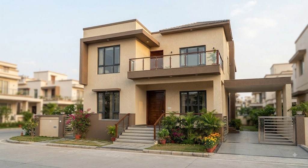
Why Exterior Colour Matters More Than People Think
Your façade is the first thing anyone sees — before they see your layout, your interiors, or the thought you put into your front elevation design. A well-chosen exterior colour combination does three jobs at once: it protects your walls from sun and rain damage (lighter, reflective colours genuinely reduce heat absorption into the structure), it shapes how buyers or visitors perceive the value of your home before they’ve stepped inside, and it either supports or undermines the architectural style you’ve already invested in through your elevation. A striking modern elevation with the wrong colour combination on top of it looks like a missed opportunity — we see this more often than you’d expect on otherwise well-planned homes.
The 60-30-10 Rule: The Foundation of Every Good Exterior Palette
Before picking specific shades, get this ratio right, because it’s the difference between an exterior that looks intentional and one that looks like it was decided room by room.
- 60% — Dominant colour: This covers the main body of the house — your primary wall surface. It should be the colour you’re most comfortable committing to long-term, since it’s what people notice first and what dominates your street presence.
- 30% — Secondary colour: Applied to pillars, plinths, window borders, and projecting or recessed sections. This is where you introduce contrast and depth without overwhelming the main structure.
- 10% — Accent colour: Reserved for doors, window frames, railings, and small architectural details. This is where you can afford to be a little bolder, since it’s a small enough proportion that it reads as a deliberate highlight rather than a risk.
Most exterior colour combinations that feel “off” once painted didn’t actually pick bad colours — they picked a bad ratio, usually splitting the façade closer to 50-50 between two strong colours, which reads as busy rather than balanced.
Climate-Smart Colour Choices for Indian Homes
This is the part generic, US-facing colour guides usually skip, and it’s arguably the most important consideration for Indian homeowners. Indian homes face a genuinely different set of conditions — intense direct sun for much of the year, heavy monsoon staining, dust accumulation in urban and semi-urban areas, and in many regions, humidity that accelerates algae growth on darker or matte surfaces.
Light, heat-reflective base colours — warm white, beige, cream, and light grey — remain the most functional choices for the dominant 60% because they reflect rather than absorb heat, which measurably helps keep interior temperatures more manageable, especially on west- and south-facing walls that take the harshest afternoon sun. Darker secondary and accent colours — charcoal grey, coffee brown, deep forest green — work well specifically because they’re used sparingly, on pillars, borders, and trim, where heat absorption matters less and dust and water staining show up less visibly than on a large flat wall.
If you’re building in a coastal or high-humidity region, ask your painter specifically about algae-resistant or anti-fungal exterior paint formulations regardless of which colour combination you choose — this matters more to long-term appearance than the shade itself.
8 Home Exterior Colour Combination Ideas for 2026
Here are the home exterior colour combination ideas we’re actually seeing work well across different home styles and budgets this year, each with where to use it and why it holds up.
1. Warm White + Charcoal Grey
The most requested combination for modern urban duplexes and villas in 2026, and for good reason. Warm white across the main structure avoids the cold, clinical feel of stark white while keeping the reflectivity benefit, and charcoal grey on pillars, window frames, and recessed sections adds sharp, architectural contrast. This pairing suits contemporary and minimalist elevations especially well.
2. Beige + Coffee Brown
One of the most forgiving combinations for Indian conditions specifically — both tones hide dust, mud splatter, and water streaking exceptionally well, which matters enormously if your home fronts an unpaved road or sees heavy monsoon runoff. Use sand beige as the dominant tone and coffee brown on staircases, borders, and structural pillars.
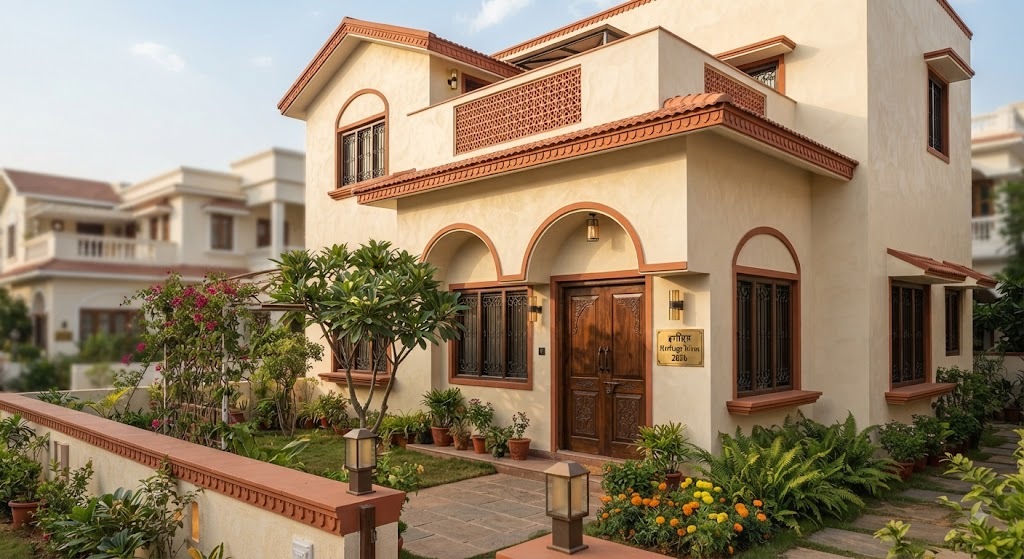
3. Terracotta + Cream
Inspired by India’s architectural heritage and genuinely well-suited to homes aiming for a traditional-meets-modern look. Terracotta brings warmth and visual energy without feeling dated, and it pairs naturally with wooden doors, window frames, and white trim. It also handles heat and dust well, making it practical as much as decorative.
4. Sage Green + Off-White
A softer, nature-inspired combination that’s gained real traction in 2026 for homes with gardens, courtyards, or significant greenery around the plot — the colours echo the landscape rather than competing with it. Works particularly well for bungalows and homes with a more organic, less rigidly geometric elevation.
5. Sky Blue + White
A cooling, calming combination, both visually and in terms of how it reads in intense sun. Pale sky blue on the main walls with white cornices and borders is a timeless choice for hot-climate regions, and it pairs beautifully with green landscaping for a naturally coordinated exterior.
6. Deep Forest Green + Warm Cream
A combination with colonial-era resonance — think heritage bungalows in hill regions — that’s being revived in new construction for its depth and character. Best suited to homes with mature trees or dense garden surroundings, where the deep green feels grounded rather than heavy.
7. Orange + Grey
The boldest option on this list, and a strong fit for smaller, more contemporary homes that want genuine street presence. Use orange as the dominant tone on the main wall and grey for borders and structural framing to keep the overall look balanced rather than overwhelming.
8. Monochrome: White, Grey and Black
A restrained, high-end palette that photographs exceptionally well and suits homes with strong geometric lines — flat roofs, clean rectangular volumes, minimal ornamentation. This combination depends entirely on your architecture doing the visual work, since the colour palette itself is deliberately quiet.
Matching Home Exterior Colour Combination Ideas to Your Home’s Size and Style
The right home exterior colour combination isn’t just about personal taste — it should respond to your house’s actual scale and architectural language, the same way we approach choosing a house plan for your plot size.
- Compact plots (20×30, 30×40): Lean toward lighter, single-dominant palettes with minimal colour-blocking. Too many colour transitions on a smaller façade reads as cluttered rather than detailed, and light colours make a compact home feel more open from the street.
- Mid-size plots (40×60, 30×50): This is where two-tone combinations like beige-and-coffee-brown or warm-white-and-charcoal genuinely shine, since there’s enough wall surface to establish the 60-30-10 ratio clearly without it feeling cramped.
- Larger plots and villas (50×80 and above): Can support bolder or deeper combinations — forest green, terracotta, richer contrasts — since the increased façade area and typically larger setbacks give the eye more room to read the full composition rather than a single overwhelming block of colour.
- Modern minimalist elevations: Favour the monochrome or warm-white-and-charcoal combinations, since these styles rely on clean colour blocking rather than ornamental detail.
- Traditional or heritage-inspired elevations: Terracotta-and-cream or deep-green-and-cream combinations tend to complement traditional detailing — arches, jaali work, sloped roofs — far better than stark modern palettes.
Common Mistakes to Avoid
- Choosing colour from a small paint chip indoors. Always test a large sample patch on the actual wall and view it at different times of day — morning, midday, and evening light change a colour’s appearance dramatically.
- Ignoring maintenance from the start. A striking dark colour that shows every water stain within one monsoon season isn’t a good long-term choice, regardless of how it looks in renders.
- Splitting the façade too evenly between two colours. This is the single most common reason a well-intentioned two-tone exterior ends up looking busy rather than balanced — stick to the 60-30-10 ratio.
- Choosing colours in isolation from the roof, flooring, and boundary wall. Your exterior palette should read as one composition, not a wall colour decided independently of everything else on the plot.
- Underestimating how colour interacts with your home’s actual architecture. The same combination that looks striking on a flat-roofed modern villa can look mismatched on a traditional sloped-roof home, and vice versa — this is exactly the kind of judgment call worth bringing into your elevation design conversation early rather than after the walls are already painted.
Cost and Practical Considerations
Exterior paint quality matters as much as colour choice for how long your combination actually looks good. Weather-resistant, UV-stable exterior emulsions cost more upfront than standard paint but hold their colour and finish considerably longer against Indian sun and monsoon conditions — a real cost-saving over a five-to-seven-year horizon, since repainting an entire façade is a significant expense to repeat unnecessarily. Textured finishes (which many of the 2026 trending combinations lean into) also cost more per square foot than flat paint but do genuinely better work concealing minor surface imperfections and dust accumulation between paint cycles.
If you’re still finalizing your layout and haven’t locked in your elevation yet, this is worth deciding alongside your 3D visualization and walkthrough process rather than after — seeing your actual chosen colour combination rendered on your specific elevation, in your specific site conditions, catches mismatches a paint chip never will.
Frequently Asked Questions
What is the most popular home exterior colour combination for Indian homes in 2026? Warm white paired with charcoal grey is currently the most requested combination for modern urban homes, while beige-and-coffee-brown remains the most practical, dust- and stain-resistant choice for homes in high-traffic or unpaved-road locations.
What is the 60-30-10 rule for exterior colours? It’s a ratio guideline: 60% of the façade in your dominant colour, 30% in a secondary contrasting colour on pillars and borders, and 10% in an accent colour on doors, frames, and railings. It’s the single most reliable way to keep a multi-colour exterior looking balanced rather than busy.
Which exterior colours reflect heat best in India’s climate? Light, warm-toned colours — warm white, beige, cream, and light grey — reflect more heat than dark colours and are generally the better choice for the dominant wall colour on homes without significant shading or tree cover.
Should exterior colour match the interior colour scheme? Not directly, but they should feel like part of the same overall design language — the transition from your front elevation into your entryway and interior palette shouldn’t feel jarring, which is part of why we handle exterior and interior colour planning together rather than as separate decisions.
How do I choose an exterior colour combination for a small house? Favour a lighter, single-dominant palette with minimal colour-blocking. Smaller façades read as cluttered rather than sophisticated when too many colours compete for attention, so restraint tends to look more expensive than complexity.
The Bottom Line
The best home exterior colour combination ideas for 2026 aren’t really about chasing this year’s trending shade — they’re about applying the 60-30-10 rule correctly, choosing colours that genuinely perform in Indian heat and monsoon conditions, and matching the palette to your home’s actual size and architectural style rather than a photo you saved online. Get those three things right, and almost any of the combinations above — from warm white and charcoal to terracotta and cream — will hold up both visually and practically for years, not just for the first dry season.
If you’re finalizing your elevation and want to see how a specific colour combination will actually look on your home’s design before committing, book a consultation with our team — we walk every client through 3D visualization before a single litre of paint gets ordered.