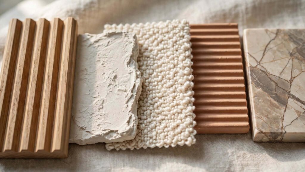
Tactile textures have become the defining idea in interior design this year, and unlike a lot of design trends, this one isn’t really about how a room looks in a photo — it’s about how it feels in your hand. Fluted wood paneling, hand-finished plaster, bouclé upholstery, ridged ceramics, raw stone with visible veining: the common thread running through 2026’s biggest design moves is a shift away from flat, polished surfaces toward ones you actually want to touch.
What makes this trend worth a proper explanation rather than another “textures we love” roundup is that it’s being described under several different names by different design publications right now — Texture-Maxxing, Haptic Luxury, Tactile Maximalism, Organic Luxe — and almost nobody has pointed out that these are, in large part, the same underlying movement. This guide pulls that apart clearly, covers the actual materials and techniques driving it, the (genuinely interesting) wellness research behind why it’s resonating now, and how to layer texture in your own home without it tipping into clutter. If you’d like tactile textures built into your space architecturally rather than just decoratively, that’s exactly the kind of material-led design work our team handles through Archtra’s interior design services.
Table of Contents
- What “Tactile Textures” Actually Means
- Why This Movement Is Happening Now
- Different Names, Same Movement
- The Core Materials Driving the Trend
- The Wellness Case for Tactile Design
- How to Layer Texture Without It Looking Cluttered
- Tactile Textures in Architecture, Not Just Decor
- Room-by-Room Application
- Tactile Design on Any Budget
- Common Mistakes to Avoid
- Frequently Asked Questions
What “Tactile Textures” Actually Means
Tactile textures refers to surfaces and materials that offer genuine physical dimension — grain, ridges, weave, roughness, softness — rather than a flat surface that only looks textured. This distinction matters more than most articles acknowledge: a printed fabric that mimics a woven pattern is visually textured but offers no real grain or resistance underhand, while genuine tactile materials provide actual softness, warmth, and physical variation that create a real interactive bond between a person and their space. The 2026 movement is specifically about the latter — real material depth, not a texture-patterned wallpaper standing in for the real thing.
Why This Movement Is Happening Now
A few forces are converging to push tactile textures to the front of interior design conversations:
- Digital fatigue is real, and designers are responding to it. The vast majority of our waking hours are now spent interacting with flat, smooth, frictionless surfaces — phones, keyboards, touchscreens. The home has become one of the few environments where physical variation can be deliberately reintroduced, and designers are leaning into that hard.
- The data backs it up. Industry tracking cited by design researchers shows textured décor — plaster, resin, linen, and acrylic blends — has grown more than 40% year-on-year, and a large majority of homeowners now cite texture as a primary factor when choosing wall art and finishes, a dramatic shift from flat prints and matte canvases.
- A broader reaction against “overly polished” interiors. Several 2026 design trend reports describe the same shift: a clear move away from perfectly styled, high-gloss spaces toward ones that feel grounded, lived-in, and authentic.
- Craftsmanship and longevity are back in demand. Alongside tactile textures, 2026 trend coverage consistently pairs this movement with renewed appreciation for architectural millwork, natural materials, and finishes designed to age well rather than stay pristine.
Different Names, Same Movement
This is the single biggest gap in the current coverage of tactile textures: multiple design outlets have independently named essentially the same shift, without cross-referencing each other, which leaves readers with a confusing patchwork of “new trends” that are actually one trend:
- “Texture-Maxxing” — framed as a shift from purely visual design toward sensory-rich spaces, with layered materials on furniture and walls.
- “Haptic Luxury” — framed around the wellness angle, emphasizing natural, grounding materials as a counterbalance to digital flatness.
- “Tactile Maximalism” — framed around bold, layered combinations of wood, metal, and other dimensional materials creating a volumetric, multi-layered interior.
- “Organic Luxe” — framed around honest, tactile materials like richly grained wood, pronounced stone veining, and artisanal textiles.
Strip away the branding, and all four describe the same underlying shift: real, physical material texture replacing flat, uniform surfaces as the primary design language of the moment. Understanding that these are variations on one movement, rather than four separate competing trends, makes it far easier to actually plan a cohesive room around tactile textures instead of chasing four different hashtags.
The Core Materials Driving the Trend
A handful of materials and techniques show up again and again across every version of this trend:
- Fluted and reeded millwork — linear grooves cut into wood paneling, cabinetry, and furniture, replacing flat, smooth surfaces with sculptural rhythm and movement.
- Hand-finished and textured plaster — walls and ceilings finished with visible trowel marks, ridges, or raised layers rather than a perfectly smooth, sprayed finish. (If you’re drawn to this material specifically, our guide to emerging sustainable building materials covers lime plaster’s history and performance in more depth.)
- Bouclé and tactile upholstery — a texture that moved from a seasonal trend to a genuine staple, now extending beyond accent chairs into sofas, headboards, and cushions.
- Natural stone with visible veining — porcelain and natural stone surfaces celebrated for organic variation rather than uniform, high-gloss perfection.
- Ribbed, fluted, and 3D tile — particularly on feature walls and shower surrounds, adding dimension that flat subway tile simply can’t.
- Unlacquered and patinated metals — brass, bronze, and steel left to age and develop character rather than staying factory-polished.
- Handmade and gently ridged ceramics — lighting, vessels, and tableware chosen specifically for their irregular, handcrafted quality.
The Wellness Case for Tactile Design
This is a dimension almost entirely missing from decor-focused coverage of tactile textures, despite being one of the more compelling reasons the trend has resonated so broadly. Researchers studying tactile and sensory interaction with natural, textured materials have documented measurable physiological effects — tactile and olfactory engagement with natural materials has been linked to drops in heart rate and stress-hormone response, which tracks with the broader, well-established body of research on nature-connected design reducing stress. In plain terms, deliberately reintroducing physical variation into a home environment appears to have a genuine calming effect, not just a visual one. This is worth treating as a reasonably well-supported design rationale rather than overstated marketing language — the effect is real, even if any individual statistic should be read as directional rather than a precise, universally applicable number.
How to Layer Texture Without It Looking Cluttered
The most common fear around tactile textures — that a heavily textured room will look busy or chaotic — is addressed directly by a few practical rules most competing guides skip:
- Follow a 70-20-10 layering ratio. Roughly 70% of a room’s texture should come from one dominant, calming material (a wool rug, a linen sofa), 20% from a secondary complementary texture (a ribbed ceramic lamp, fluted paneling), and 10% from a bold, standout accent (a sculptural stone object, a heavily textured art piece). This mirrors the logic of the 60-30-10 color rule, applied to tactile dimension instead of hue.
- Aim for at least three distinct textures on key furniture pieces (a sofa or bed), which research on the trend has identified as a practical threshold for a room to read as genuinely “texture-maxxed” rather than flat.
- Keep your color palette consistent while varying texture. Mixing textures, shapes, and materials works best when the overall palette stays within a cohesive, usually warm-neutral range — otherwise, color variation and texture variation compete for attention rather than supporting each other.
- Warm the lighting. Lighting around 2700K (a warm, soft white) brings out the depth and shadow play in textured surfaces far better than cooler, bluer light, which tends to flatten dimensional materials visually.
- Don’t ignore acoustics. Heavily textured, hard-surfaced rooms (lots of stone, plaster, and tile) can become acoustically harsh without enough soft material — textiles, rugs, upholstered furniture — to absorb sound, undermining the comforting effect texture is supposed to create.
Tactile Textures in Architecture, Not Just Decor
Most coverage of this trend treats it purely as a decor and furnishing conversation — new throw pillows, a textured lamp — without addressing how it shows up structurally in a building’s actual architecture. This is where the movement gets more interesting and more permanent:
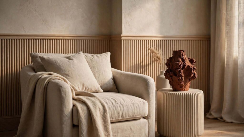
- Fluted and reeded wall paneling, built directly into a room’s architecture rather than applied as a decorative panel afterward.
- Textured plaster walls and ceilings, specified as a finish material from the earliest design stage rather than a late-stage decorating decision.
- Dimensional tile applications, including ribbed and 3D tile used on structural feature walls and shower surrounds.
- Natural stone selection with intentional veining and texture, chosen during material specification rather than treated as a generic finish category.
This architectural application overlaps closely with the material-led, craftsmanship-forward thinking behind modern heritage design, another major 2026 movement — in fact, tactile textures and modern heritage design are frequently described by trend forecasters as reinforcing each other, since both prioritize visible craft and material honesty over flat, uniform perfection.
Room-by-Room Application
Living Room
Layer a wool or bouclé sofa with a linen throw and a ribbed ceramic side table, then add one architectural moment — a fluted accent wall or a textured plaster fireplace surround — as your 10% standout element.
Bedroom
A textured linen or bouclé headboard, a chunky knit or wool throw, and a ribbed ceramic lamp bring tactile textures into the room’s most restful space without overwhelming it.
Kitchen
Unlacquered brass or aged metal hardware, a natural stone countertop with visible veining, and handmade or ridged tile on a backsplash introduce genuine material texture into a space that’s traditionally dominated by smooth, hard surfaces.
Bathroom
Textured plaster or ribbed 3D tile on a feature wall or shower surround, paired with a honed (rather than polished) natural stone vanity top, brings warmth into a room that can otherwise feel clinical.
Entryway
A textured plaster or fluted millwork wall, paired with a natural fiber rug and a handmade ceramic vessel, sets a tactile, grounded tone from the moment someone walks in. If you’re exploring which broader aesthetic this fits into for your whole home, our complete guide to interior design styles is a useful companion read, since tactile textures layer especially well into Japandi, Modern Heritage, and Organic Modern spaces.
Tactile Design on Any Budget
- Budget-friendly: Add a wool or bouclé throw pillow, swap a flat-print wall art piece for one with real dimension, and introduce a single handmade ceramic object.
- Mid-range: Invest in a textured upholstered accent chair, a ribbed ceramic lighting fixture, and a natural fiber rug with real weave.
- Higher investment: Specify fluted millwork, hand-applied textured plaster, or dimensional tile as part of a renovation, built into the architecture rather than layered on afterward.
Common Mistakes to Avoid
- Confusing printed texture with real texture. As covered above, a flat surface printed to look woven or grained doesn’t deliver the same sensory or design effect as genuine material dimension.
- Overloading a single room. More than a handful of competing bold textures in one space can tip from “layered and rich” into visually chaotic — the 70-20-10 ratio helps keep this in check.
- Ignoring acoustics. Hard, heavily textured surfaces without enough soft material to absorb sound can make a room feel harsh rather than cozy.
- Treating it as purely decorative. As the architecture section above covers, the most durable, design-forward applications of tactile textures are built into finishes and millwork, not just added through furnishings that are easy to swap out later.
- Mixing too many color families alongside texture variation. Keeping the palette consistent while varying texture is what keeps a heavily tactile room feeling intentional rather than busy. For more on avoiding layout and styling missteps generally, our guide to common interior design mistakes is worth a look alongside this one.
Frequently Asked Questions
1. What’s the difference between tactile textures and just “texture” in general design? Tactile textures specifically refers to real, physical material dimension — grain, weave, ridges, roughness — that you can genuinely feel, as opposed to purely visual texture like a printed fabric pattern that looks textured but offers no actual physical variation underhand.
2. Is “tactile textures” the same trend as “Texture-Maxxing” or “Haptic Luxury”? Largely yes. Different design publications have given this movement different names — Texture-Maxxing, Haptic Luxury, Tactile Maximalism, Organic Luxe — but they all describe the same underlying shift toward real, physical material depth replacing flat, uniform surfaces.
3. Why is texture suddenly such a major design focus in 2026? A combination of factors: documented growth in textured décor sales, a strong majority of homeowners citing texture as a primary factor in design choices, a broader reaction against overly polished interiors, and genuine wellness research linking tactile, natural materials to measurable stress reduction.
4. How do I add tactile textures without making a room look cluttered? Follow a roughly 70-20-10 layering ratio (one dominant texture, one secondary texture, one bold accent), keep your color palette consistent even as texture varies, and aim for at least three distinct textures on key furniture pieces rather than scattering texture randomly throughout the room.
5. Is there real science behind tactile design improving wellbeing? There’s a reasonable, growing body of research linking tactile and sensory interaction with natural materials to measurable drops in stress indicators like heart rate and cortisol, consistent with broader research on nature-connected design. It’s worth treating as genuinely supported, while recognizing any single statistic should be read as directional rather than a precise universal figure.
6. What materials define the tactile textures trend? Fluted and reeded wood millwork, hand-finished textured plaster, bouclé and tactile upholstery, natural stone with visible veining, ribbed and 3D tile, unlacquered or patinated metal, and handmade ceramics are the materials showing up most consistently across the trend.
7. Can tactile textures be incorporated into a home’s architecture, not just its decor? Yes, and arguably this is the more durable, design-forward application — fluted wall paneling, textured plaster finishes, and dimensional tile can all be specified as part of a renovation or new build’s actual material palette, rather than added later through furnishings alone.
8. What lighting works best with heavily textured interiors? Warm lighting around 2700K brings out the shadow and depth in textured surfaces far more effectively than cooler, bluer lighting, which tends to visually flatten dimensional materials.
9. Does tactile design work with minimalist or Japandi-style interiors? Yes — in fact, texture is often what keeps a minimalist or Japandi space from feeling cold, since restrained color palettes rely heavily on material texture (linen, wood grain, ceramic) to carry warmth and visual interest instead of pattern or color.
10. What’s the most common mistake people make when trying this trend? Confusing printed or purely visual texture with genuine tactile material, and overloading a single room with too many competing bold textures rather than following a clear dominant-secondary-accent layering structure.
Final Thoughts
Tactile textures have staying power precisely because the appeal isn’t trend-driven in the usual sense — it’s a direct, understandable response to spending most of our lives surrounded by flat, frictionless digital surfaces. Whether you call it Texture-Maxxing, Haptic Luxury, or simply “finally touching something real,” the underlying principle is the same: real material depth, layered with intention, makes a home feel genuinely lived-in rather than merely photographed.
If you’d like tactile textures built into your space architecturally — fluted millwork, hand-finished plaster, dimensional tile — rather than layered on through furnishings alone, our team at Archtra can integrate these material choices from the earliest design stage. Browse our project portfolio for examples of our material-led design approach, or reach out to our design team to start planning your space.